
In addition to all the default Hugo shortcodes, Blowfish adds a few extras for additional functionality.
Alert#
alert outputs its contents as a stylised message box within your article. It’s useful for drawing attention to important information that you don’t want the reader to miss.
| Parameter | Description |
|---|---|
icon | Optional. the icon to display on the left side. Default: triangle-exclamation (Check out the icon shortcode for more details on using icons.) |
iconColor | Optional. the color for the icon in basic CSS style. Can be either hex values ( #FFFFFF) or color names (white)By default chosen based on the current color theme . |
cardColor | Optional. the color for the card background in basic CSS style. Can be either hex values ( #FFFFFF) or color names (white)By default chosen based on the current color theme . |
textColor | Optional. the color for the text in basic CSS style. Can be either hex values ( #FFFFFF) or color names (white)By default chosen based on the current color theme . |
The input is written in Markdown so you can format it however you please.
Example 1: No params
{{< alert >}}
**Warning!** This action is destructive!
{{< /alert >}}Example 2: Unnamed param
{{< alert "twitter" >}}
Don't forget to [follow me](https://twitter.com/nunocoracao) on Twitter.
{{< /alert >}}Example 3: Named params
{{< alert icon="fire" cardColor="#e63946" iconColor="#1d3557" textColor="#f1faee" >}}
This is an error!
{{< /alert >}}Admonition#
Admonitions allow you to insert eye-catching callout boxes in your content.
Admonitions serve a similar purpose as the alert shortcode but are implemented via Hugo render hooks. The key difference is syntax: admonitions use Markdown syntax, making them more portable across different platforms, whereas shortcodes are specific to Hugo. The syntax resembles GitHub alerts:
> [!TIP]
> A Tip type admonition.

> [!TIP]+ Custom Title + Custom Icon
> A collapsible admonition with custom title.
{icon="twitter"}A Tip type admonition.
Custom Title + Custom Icon
A collapsible admonition with custom title.
The alert sign (+ or -) is optional to control whether the admonition is folded or not. Note that alert sign is only compatible in Obsidian.
Supported types
Valid admonition types include GitHub alert types and Obsidian callout types. The types are case-insensitive.
GitHub types: NOTE, TIP, IMPORTANT, WARNING, CAUTION
Obsidian types: note, abstract, info, todo, tip, success, question, warning, failure, danger, bug, example, quote
Customize admonition
See the admonition customization guide.
Accordion#
accordion creates a collapsible set of panels. Use the accordionItem sub-shortcode to define each item. You can control whether multiple items can be open at the same time using the mode parameter.
| Parameter | Description |
|---|---|
mode | Optional. collapse (single open) or open (multiple open). Defaults to collapse. |
separated | Optional. true to show each item as a separate card. Defaults to false (joined list). |
accordionItem parameters:
| Parameter | Description |
|---|---|
title | Required. Title shown in the item header. |
open | Optional. Set to true to have the item open by default. |
header | Optional. Alias for title, kept for compatibility with other shortcodes. |
icon | Optional. Icon name to display before the title. |
align | Optional. Align text within the item: left, center, right |
Example 1: mode="open" (multiple items can be open) + separated=true
{{< accordion mode="open" separated=true >}}
  {{< accordionItem title="Markdown example" icon="code" open=true >}}
  This item demonstrates Markdown rendering:
  - **Bold text**
  - Lists
  - `inline code`
  {{< /accordionItem >}}

  {{< accordionItem title="Shortcode example" md=false >}}
  This item demonstrates shortcode rendering with <code>md=false</code>:

  {{< alert >}}This is an inline alert.{{< /alert >}}
  {{< /accordionItem >}}
{{< /accordion >}}
Markdown example
This item demonstrates Markdown rendering:
- Bold text
- Lists
inline code
Shortcode example
md=false:Example 2: mode="collapse" (only one item open at a time)
{{< accordion mode="collapse" >}}
  {{< accordionItem title="First item" open=true >}}
  This item uses Markdown with a short list:
  1. One
  2. Two
  3. Three
  {{< /accordionItem >}}

  {{< accordionItem title="Second item" md=false >}}
  This item includes another shortcode:
  {{< badge >}}Tip{{< /badge >}}
  {{< /accordionItem >}}
{{< /accordion >}}
First item
This item uses Markdown with a short list:
- One
- Two
- Three
Second item
Ansible Galaxy Card#
ansible renders a card for an Ansible Galaxy entry, fetched at build time. It accepts either a role or a collection parameter, both in namespace.name form.
| Parameter | Description |
|---|---|
role | [String] Galaxy role in the format namespace.name, e.g. geerlingguy.docker |
collection | [String] Galaxy collection in the format namespace.name, e.g. community.general |
Set exactly one of role or collection per call.
All card values are fetched at build time via Hugo’s resources.GetRemote. Galaxy does not allow cross-origin requests, so the card is not refreshed in the browser — rebuild the site to update the values.
Example 1: Role
{{< ansible role="geerlingguy.docker" >}}Example 2: Collection
{{< ansible collection="community.general" >}}Article#
Article will embed a single article into a markdown file. The link to the file should be the .RelPermalink of the file to be embedded. Note that the shortcode will not display anything if it’s referencing it’s parent. Note: if you are running your website in a subfolder like Blowfish (i.e. /blowfish/) please include that path in the link.
| Parameter | Description |
|---|---|
link | Required. the .RelPermalink to the target article. |
showSummary | Optional. A boolean value indicating whether to show the article summary. If not set, the site’s default configuration will be used. |
compactSummary | Optional. A boolean value indicating whether to display the summary in compact mode. Default to false. |
Example:
{{< article link="/docs/welcome/" showSummary=true compactSummary=true >}}
Welcome to Blowfish
Badge#
badge outputs a styled badge component which is useful for displaying metadata.
Example:
{{< badge >}}
New article!
{{< /badge >}}Button#
button outputs a styled button component which can be used to highlight a primary action. It has four optional variables pageRef, href, target and rel. pageRef resolves an internal page reference using the current page context, producing a language- and trailing-slash-aware URL that is consistent with the theme’s navigation menus. href accepts any URL or path. When both are set, pageRef takes precedence.
Example:
{{< button href="#button" target="_self" >}}
Call to action
{{< /button >}}Example using pageRef:
{{< button pageRef="docs/getting-started" >}}
Get started
{{< /button >}}Carousel#
carousel is used to showcase multiple images in an interactive and visually appealing way. This allows a user to slide through multiple images while only taking up the vertical space of a single one. All images are displayed using the full width of the parent component and the aspect ratio you set with a default of 16:9.
| Parameter | Description |
|---|---|
images | Required. A regex string to match image names or URLs. |
captions | Optional. A list of key:caption pairs. Keys can be image filenames (for local images) or full URLs (for remote images). Captions support Markdown. |
aspectRatio | Optional. The aspect ratio for the carousel. It is set to 16-9 by default. |
interval | Optional. The interval for the auto-scrooling, specified in milliseconds. Defaults to 2000 (2s) |
Captions are matched by key. For local images, use the filename (e.g. 01.jpg). For remote images, use the full URL.
Example 1: 16:9 aspect ratio and verbose list of images
{{< carousel images="{https://cdn.pixabay.com/photo/2016/12/11/12/02/mountains-1899264_960_720.jpg,gallery/03.jpg,gallery/01.jpg,gallery/02.jpg,gallery/04.jpg}" >}}
Example 2: 21:9 aspect ratio and regex-ed list of images
{{< carousel images="gallery/*" aspectRatio="21-9" interval="2500" >}}
Example 3: Add captions
{{< carousel images="gallery/*" captions="{01.jpg:First image with *formatting*,02.jpg:Second image with a [link](https://example.com)}" >}}Chart#
chart uses the Chart.js library to embed charts into articles using simple structured data. It supports a number of different chart styles and everything can be configured from within the shortcode. Simply provide the chart parameters between the shortcode tags and Chart.js will do the rest.
Refer to the official Chart.js docs for details on syntax and supported chart types.
Example:
{{< chart >}}
type: 'bar',
data: {
  labels: ['Tomato', 'Blueberry', 'Banana', 'Lime', 'Orange'],
  datasets: [{
    label: '# of votes',
    data: [12, 19, 3, 5, 3],
  }]
}
{{< /chart >}}
You can see some additional Chart.js examples on the charts samples page.
Code Importer#
This shortcode is for importing code from external sources easily without copying and pasting.
| Parameter | Description |
|---|---|
url | Required URL to an externally hosted code file. |
type | Code type used for syntax highlighting. |
startLine | Optional The line number to start the import from. |
endLine | Optional The line number to end the import at. |
Example:
{{< codeimporter url="https://raw.githubusercontent.com/nunocoracao/blowfish/main/layouts/shortcodes/mdimporter.html" type="go" >}}{{ $url := .Get "url" }}
{{ with resources.GetRemote (urls.Parse $url) }}
{{ .Content | markdownify }}
{{ else }}
{{ warnf "mdimporter shortcode: unable to fetch %q: %s" $url .Position }}
{{ end }}{{< codeimporter url="https://raw.githubusercontent.com/nunocoracao/blowfish/main/config/_default/hugo.toml" type="toml" startLine="11" endLine="18" >}}enableRobotsTXT = true
summaryLength = 0
buildDrafts = false
buildFuture = false
enableEmoji = trueCodeberg Card#
codeberg allows you to quickly link a Codeberg repository via the Codeberg API, providing real-time updates on stats such as stars and forks.
| Parameter | Description |
|---|---|
repo | [String] codeberg repo in the format of username/repo |
Example 1:
{{< codeberg repo="forgejo/forgejo" >}}Email#
Creates an obfuscated mailto link:
{{< email email="mailto:hello@test.com" text="text" subject="Reply to awesome article" >}}Figure#
Blowfish includes a figure shortcode for adding images to content. The shortcode replaces the base Hugo functionality in order to provide additional performance benefits.
When a provided image is a page resource, it will be optimised using Hugo Pipes and scaled in order to provide images appropriate to different device resolutions. If a static asset or URL to an external image is provided, it will be included as-is without any image processing by Hugo.
The figure shortcode accepts six parameters:
| Parameter | Description |
|---|---|
src | Required. The local path/filename or URL of the image. When providing a path and filename, the theme will attempt to locate the image using the following lookup order: Firstly, as a page resource bundled with the page; then an asset in the assets/ directory; then finally, a static image in the static/ directory. |
alt | Alternative text description for the image. |
caption | Markdown for the image caption, which will be displayed below the image. |
class | Additional CSS classes to apply to the image. |
figureClass | Additional CSS classes to apply to the <figure> wrapper. Useful for galleries. |
href | URL that the image should be linked to. |
target | The target attribute for the href URL. |
nozoom | nozoom=true disables the image “zoom” functionality. This is most useful in combination with a href link. |
default | Special parameter to revert to default Hugo figure behaviour. Simply provide default=true and then use normal Hugo shortcode syntax. |
Blowfish also supports automatic conversion of images included using standard Markdown syntax. Simply use the following format and the theme will handle the rest:
Example:
{{< figure
src="abstract.jpg"
alt="Abstract purple artwork"
caption="Photo by [Jr Korpa](https://unsplash.com/@jrkorpa) on [Unsplash](https://unsplash.com/)"
>}}
<!-- OR -->
 on [Unsplash](https://unsplash.com/)")
Forgejo Card#
forgejo allows you to quickly link a Forgejo repository via the forgejo API, providing real-time updates on stats such as stars and forks.
| Parameter | Description |
|---|---|
repo | [String] forgejo repo in the format of username/repo |
server | [String] server URL like https://v11.next.forgejo.org |
Example 1:
{{< forgejo server="https://v11.next.forgejo.org" repo="a/mastodon" >}}Gallery#
gallery allows you to showcase multiple images at once, in a responsive manner with more varied and interesting layouts.
In order to add images to the gallery, use img tags for each image and add class="grid-wXX" in order for the gallery to be able to identify the column width for each image. The widths available by default start at 10% and go all the way to 100% in 5% increments. For example, to set the width to 65%, set the class to grid-w65. Additionally, widths for 33% and 66% are also available in order to build galleries with 3 cols. You can also leverage tailwind’s responsive indicators to have a reponsive grid.
If you need captions, you can use the figure shortcode inside the gallery. When doing so, set the grid width on the figure using figureClass, and use caption for the text.
Example 1: normal gallery
{{< gallery >}}
  <img src="gallery/01.jpg" class="grid-w33" />
  <img src="gallery/02.jpg" class="grid-w33" />
  <img src="gallery/03.jpg" class="grid-w33" />
  <img src="gallery/04.jpg" class="grid-w33" />
  <img src="gallery/05.jpg" class="grid-w33" />
  <img src="gallery/06.jpg" class="grid-w33" />
  <img src="gallery/07.jpg" class="grid-w33" />
{{< /gallery >}}


Example 2: responsive gallery
{{< gallery >}}
  <img src="gallery/01.jpg" class="grid-w50 md:grid-w33 xl:grid-w25" />
  <img src="gallery/02.jpg" class="grid-w50 md:grid-w33 xl:grid-w25" />
  <img src="gallery/03.jpg" class="grid-w50 md:grid-w33 xl:grid-w25" />
  <img src="gallery/04.jpg" class="grid-w50 md:grid-w33 xl:grid-w25" />
  <img src="gallery/05.jpg" class="grid-w50 md:grid-w33 xl:grid-w25" />
  <img src="gallery/06.jpg" class="grid-w50 md:grid-w33 xl:grid-w25" />
  <img src="gallery/07.jpg" class="grid-w50 md:grid-w33 xl:grid-w25" />
{{< /gallery >}}
Example 3: gallery with captions (using figure)
{{< gallery >}}
  {{< figure src="gallery/01.jpg" alt="Gallery image 1" caption="First caption" figureClass="grid-w33" >}}
  {{< figure src="gallery/02.jpg" alt="Gallery image 2" caption="Second caption" figureClass="grid-w33" >}}
  {{< figure src="gallery/03.jpg" alt="Gallery image 3" caption="Third caption" figureClass="grid-w33" >}}
{{< /gallery >}}


Gist#
gist shortcode allows you to embed a GitHub Gist directly into your content by specifying the Gist user, ID, and optionally a specific file.
| Parameter | Description |
|---|---|
[0] | [String] GitHub username |
[1] | [String] Gist ID |
[2] (optional) | [String] Filename within the Gist to embed (optional) |
Example 1: Embed entire Gist
{{< gist "octocat" "6cad326836d38bd3a7ae" >}}Example 2: Embed specific file from Gist
{{< gist "rauchg" "2052694" "README.md" >}}Gitea Card#
gitea allows you to quickly link a Gitea repository via the gitea API, providing real-time updates on stats such as stars and forks.
| Parameter | Description |
|---|---|
repo | [String] gitea repo in the format of username/repo |
server | [String] server URL like https://git.fsfe.org |
Example 1:
{{< gitea server="https://git.fsfe.org" repo="FSFE/fsfe-website" >}}Source files of fsfe.org, pdfreaders.org, freeyourandroid.org, ilovefs.org, drm.info, and test.fsfe.org. Contribute: https://fsfe.org/contribute/web/
GitHub Card#
github allows you to quickly link a github repository, all while showing and updating in realtime stats about it, such as the number of stars and forks it has.
| Parameter | Description |
|---|---|
repo | [String] github repo in the format of username/repo |
showThumbnail | Optional [boolean] display a thumbnail for the repository |
Example 1:
{{< github repo="nunocoracao/blowfish" showThumbnail=true >}}GitLab Card#
gitlab allows you to quickly link a GitLab Project (GitLab’s jargon for repo).
It displays realtime stats about it, such as the number of stars and forks it has.
Unlike github it can’t display the main programming language of a project.
Finally, custom GitLab instance URL can be provided, as long as the api/v4/projects/ endpoint is available, making this shortcode compatible with most self-hosted / enterprise deployments.
| Parameter | Description |
|---|---|
projectID | [String] gitlab numeric ProjectID |
baseURL | [String] optional gitlab instance URL, default is https://gitlab.com/ |
Example 1:
{{< gitlab projectID="278964" >}}Hugging Face Card#
huggingface allows you to quickly link a Hugging Face model or dataset, displaying real-time information such as the number of likes and downloads, along with type and description.
| Parameter | Description |
|---|---|
model | [String] Hugging Face model in the format of username/model |
dataset | [String] Hugging Face dataset in the format of username/dataset |
Note: Use either model or dataset parameter, not both.
Example 1 (Model):
{{< huggingface model="google-bert/bert-base-uncased" >}}Example 2 (Dataset):
{{< huggingface dataset="stanfordnlp/imdb" >}}Icon#
icon outputs an SVG icon and takes the icon name as its only parameter. The icon is scaled to match the current text size.
Example:
{{< icon "github" >}}Output:
Icons are populated using Hugo pipelines which makes them very flexible. Blowfish includes a number of built-in icons for social, links and other purposes. Check the icon samples page for a full list of supported icons.
Custom icons can be added by providing your own icon assets in the assets/icons/ directory of your project. The icon can then be referenced in the shortcode by using the SVG filename without the .svg extension.
Icons can also be used in partials by calling the icon partial.
KaTeX#
The katex shortcode can be used to add mathematical expressions to article content using the KaTeX package. Refer to the online reference of supported TeX functions for the available syntax.
To include mathematical expressions in an article, simply place the shortcode anywhere with the content. It only needs to be included once per article and KaTeX will automatically render any markup on that page. Both inline and block notation are supported.
Inline notation can be generated by wrapping the expression in \( and \) delimiters. Alternatively, block notation can be generated using $$ delimiters.
Example:
{{< katex >}}
\(f(a,b,c) = (a^2+b^2+c^2)^3\)
\(f(a,b,c) = (a^2+b^2+c^2)^3\)
Check out the mathematical notation samples page for more examples.
Keyword#
The keyword component can be used to visually highlight certain important words or phrases, e.g. professional skills etc. The keywordList shortcode can be used to group together multiple keyword items. Each item can have the following properties.
| Parameter | Description |
|---|---|
icon | Optional icon to be used in the keyword |
The input is written in Markdown so you can format it however you please.
Example1 :
{{< keyword >}} *Super* skill {{< /keyword >}}Example2 :
{{< keywordList >}}
{{< keyword icon="github" >}} Lorem ipsum dolor. {{< /keyword >}}
{{< keyword icon="code" >}} **Important** skill {{< /keyword >}}
{{< /keywordList >}}

{{< keyword >}} *Standalone* skill {{< /keyword >}}Lead#
lead is used to bring emphasis to the start of an article. It can be used to style an introduction, or to call out an important piece of information. Simply wrap any Markdown content in the lead shortcode.
Example:
{{< lead >}}
When life gives you lemons, make lemonade.
{{< /lead >}}List#
List will display a list of recent articles. This shortcode requires a limit value to constraint the list. Additionally, it supports a where and a value in order to filter articles by their parameters. Note that this shortcode will not display its parent page but it will count for the limit value.
| Parameter | Description |
|---|---|
limit | Required. the number of recent articles to display. |
title | Optional title for the list, default is Recent |
cardView | Optional card view enabled for the list, default is false |
where | The variable to be used for the query of articles e.g. Type |
value | The value that will need to match the parameter defined in where for the query of articles e.g. for where == Type a valid value could be sample |
where and value values are used in the following query where .Site.RegularPages $where $value in the code of the shortcode. Check Hugo docs to learn more about which parameters are available to use.Example #1:
{{< list limit=2 >}}Recent
Example #2:
{{< list title="Samples" cardView=true limit=6 where="Type" value="sample" >}}Samples
Icons
LTR/RTL#
ltr and rtl allows you to mix your contents. Many RTL language users want to include parts of the content in LTR. Using this shortcode will let you do so, and by leveraging % as the outer-most dilemeter in the shortcode Hugo shortcodes, any markdown inside will be rendered normally.
Example:
- This is an markdown list.
- Its per default a LTR direction
{{% rtl %}}
- هذه القائمة باللغة العربية
- من اليمين الى اليسار
{{% /rtl %}}- This is an markdown list.
- Its per default a LTR direction
- هذه القائمة باللغة العربية
- من اليمين الى اليسار
Markdown Importer#
This shortcode allows you to import markdown files from external sources. This is useful for including content from other repositories or websites without having to copy and paste the content.
| Parameter | Description |
|---|---|
url | Required URL to an externally hosted markdown file. |
Example:
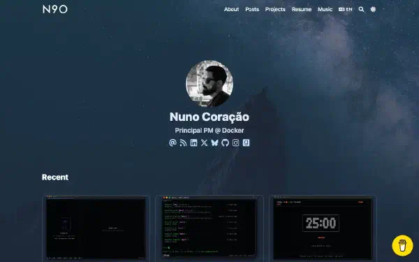
{{< mdimporter url="https://raw.githubusercontent.com/nunocoracao/nunocoracao/master/README.md" >}}Hi there 👋#
🧠 Principal PM @ Docker (AI, agents, infra) · Creator of Watchfire and Blowfish · Ex-founder · Mentor & advisor


🕯️ Creator and maintainer of Afterlight @ afterlight.club
🔥 Creator and maintainer of Watchfire @ watchfire.io - repo
🐡 Creator and maintainer of Blowfish @ blowfish.page - repo
📚 mentoring @ mentorcruise
🚀 Personal blog - n9o.xyz
Mermaid#
mermaid allows you to draw detailed diagrams and visualisations using text. It uses Mermaid under the hood and supports a wide variety of diagrams, charts and other output formats.
Simply write your Mermaid syntax within the mermaid shortcode and let the plugin do the rest.
Refer to the official Mermaid docs for details on syntax and supported diagram types.
Example:
{{< mermaid >}}
graph LR;
A[Lemons]-->B[Lemonade];
B-->C[Profit]
{{< /mermaid >}}
graph LR; A[Lemons]-->B[Lemonade]; B-->C[Profit]
You can see some additional Mermaid examples on the diagrams and flowcharts samples page.
Swatches#
swatches outputs a set of up to three different colors to showcase color elements like a color palette. This shortcode takes the HEX codes of each color and creates the visual elements for each.
Example
{{< swatches "#64748b" "#3b82f6" "#06b6d4" >}}Output
Tabs#
The tabs shortcode is commonly used to present different variants of a particular step. For example, it can be used to show how to install VS Code on different platforms.
| Parameter | Description |
|---|---|
group | Optional. Group name for synchronized tab switching. All tabs with the same group name will switch together. |
default | Optional. Label of the tab to be active by default. If not set, the first tab will be active. |
label | Required. The text label displayed on the tab button. |
icon | Optional. Icon name to display before the label. |
md | Optional. Render tab content as Markdown (default true). Set md=false to allow nested shortcodes inside tab content. |
Example 1: Basic Usage
{{< tabs >}}

    {{< tab label="Windows" >}}
    Install using Chocolatey:

    ```pwsh
    choco install vscode.install
    ```

    or install using WinGet

    ```pwsh
    winget install -e --id Microsoft.VisualStudioCode
    ```
    {{< /tab >}}

    {{< tab label="macOS" >}}
    ```bash
    brew install --cask visual-studio-code
    ```
    {{< /tab >}}

    {{< tab label="Linux" md=false >}}
    {{< alert >}}See [documentation](https://code.visualstudio.com/docs/setup/linux#_install-vs-code-on-linux).{{< /alert >}}
    {{< /tab >}}

{{< /tabs >}}
Output
Install using Chocolatey:
choco install vscode.installor install using WinGet
winget install -e --id Microsoft.VisualStudioCodebrew install --cask visual-studio-codeExample 2: With Group, Default, and Icon
{{< tabs group="lang" default="Python" >}}
    {{< tab label="JavaScript" icon="code" >}}
    ```javascript
    console.log("Hello");
    ```
    {{< /tab >}}

    {{< tab label="Python" icon="sun" >}}
    ```python
    print("Hello")
    ```
    {{< /tab >}}

    {{< tab label="Go" icon="moon" >}}
    ```go
    fmt.Println("Hello")
    ```
    {{< /tab >}}
{{< /tabs >}}

{{< tabs group="lang" default="Python" >}}
    {{< tab label="JavaScript" icon="code" >}}
    ```javascript
    const add = (a, b) => a + b;
    ```
    {{< /tab >}}

    {{< tab label="Python" icon="sun" >}}
    ```python
    def add(a, b): return a + b
    ```
    {{< /tab >}}

    {{< tab label="Go" icon="moon" >}}
    ```go
    func add(a, b int) int { return a + b }
    ```
    {{< /tab >}}
{{< /tabs >}}
Output
console.log("Hello");print("Hello")fmt.Println("Hello")const add = (a, b) => a + b;def add(a, b): return a + bfunc add(a, b int) int { return a + b }In this example, both tab groups share the same group="lang" parameter, so clicking any tab will synchronize both groups. The default="Python" parameter makes Python the initially active tab, and icon="code" adds an icon before each label.
Timeline#
The timeline creates a visual timeline that can be used in different use-cases, e.g. professional experience, a project’s achievements, etc. The timeline shortcode relies on the timelineItem sub-shortcode to define each item within the main timeline. Each item can have the following properties.
| Parameter | Description |
|---|---|
md | render the content as Markdown (true/false) |
icon | the icon to be used in the timeline visuals |
header | header for each entry |
badge | text to place within the top right badge |
subheader | entry’s subheader |
Example:
{{< timeline >}}

{{< timelineItem icon="github" header="header" badge="badge test" subheader="subheader" >}}
Lorem ipsum dolor sit amet, consectetur adipiscing elit. Vivamus non magna ex. Donec sollicitudin ut lorem quis lobortis. Nam ac ipsum libero. Sed a ex eget ipsum tincidunt venenatis quis sed nisl. Pellentesque sed urna vel odio consequat tincidunt id ut purus. Nam sollicitudin est sed dui interdum rhoncus.
{{< /timelineItem >}}


{{< timelineItem icon="code" header="Another Awesome Header" badge="date - present" subheader="Awesome Subheader" >}}
With html code
<ul>
  <li>Coffee</li>
  <li>Tea</li>
  <li>Milk</li>
</ul>
{{< /timelineItem >}}

{{< timelineItem icon="star" header="Shortcodes" badge="AWESOME" >}}
With other shortcodes
{{< gallery >}}
  <img src="gallery/01.jpg" class="grid-w33" />
  <img src="gallery/02.jpg" class="grid-w33" />
  <img src="gallery/03.jpg" class="grid-w33" />
  <img src="gallery/04.jpg" class="grid-w33" />
  <img src="gallery/05.jpg" class="grid-w33" />
  <img src="gallery/06.jpg" class="grid-w33" />
  <img src="gallery/07.jpg" class="grid-w33" />
{{< /gallery >}}
{{< /timelineItem >}}

{{< timelineItem icon="code" header="Another Awesome Header">}}
{{< github repo="nunocoracao/blowfish" >}}
{{< /timelineItem >}}

{{< /timeline >}}
header
badge test
subheader
Lorem ipsum dolor sit amet, consectetur adipiscing elit. Vivamus non magna ex. Donec sollicitudin ut lorem quis lobortis. Nam ac ipsum libero. Sed a ex eget ipsum tincidunt venenatis quis sed nisl. Pellentesque sed urna vel odio consequat tincidunt id ut purus. Nam sollicitudin est sed dui interdum rhoncus.Another Awesome Header
date - present
Awesome Subheader
With html code- Coffee
- Tea
- Milk
Shortcodes
AWESOME
With other shortcodes
Another Awesome Header
TypeIt#
TypeIt is the most versatile JavaScript tool for creating typewriter effects on the planet. With a straightforward configuration, it allows you to type single or multiple strings that break lines, delete & replace each other, and it even handles strings that contain complex HTML.
Blowfish implements a sub-set of TypeIt features using a shortcode. Write your text within the typeit shortcode and use the following parameters to configure the behavior you want.
| Parameter | Description |
|---|---|
tag | [String] html tag that will be used to render the strings. |
classList | [String] List of css classes to apply to the html element. |
initialString | [String] Initial string that will appear written and will be replaced. |
speed | [number] Typing speed, measured in milliseconds between each step. |
lifeLike | [boolean] Makes the typing pace irregular, as if a real person is doing it. |
startDelay | [number] The amount of time before the plugin begins typing after being initialized. |
breakLines | [boolean] Whether multiple strings are printed on top of each other (true), or if they’re deleted and replaced by each other (false). |
waitUntilVisible | [boolean] Determines if the instance will begin when loaded or only when the target element becomes visible in the viewport. The default is true |
loop | [boolean] Whether your strings will continuously loop after completing |
Example 1:
{{< typeit >}}
Lorem ipsum dolor sit amet
{{< /typeit >}}
Example 2:
{{< typeit
  tag=h1
  lifeLike=true
>}}
Lorem ipsum dolor sit amet,
consectetur adipiscing elit.
{{< /typeit >}}
Example 3:
{{< typeit
  tag=h3
  speed=50
  breakLines=false
  loop=true
>}}
"Frankly, my dear, I don't give a damn." Gone with the Wind (1939)
"I'm gonna make him an offer he can't refuse." The Godfather (1972)
"Toto, I've a feeling we're not in Kansas anymore." The Wizard of Oz (1939)
{{< /typeit >}}Video#
Blowfish includes a video shortcode for embedding local or external videos in content. The shortcode renders a <figure> wrapper with a responsive video player and an optional caption.
The video shortcode accepts the following parameters:
| Parameter | Description |
|---|---|
src | Required. Video URL or local path. Local lookup order: page resource → assets/ → static/. |
poster | Optional poster image URL or local path. If omitted, the shortcode attempts a same-name image in the page bundle. |
caption | Optional Markdown caption shown below the video. |
autoplay | true/false. Enables autoplay when true. Default: false. |
loop | true/false. Loops when true. Default: false. |
muted | true/false. Mutes when true. Default: false. |
controls | true/false. Shows the browser’s default playback controls when true. Default: true. |
playsinline | true/false. Inline playback on mobile when true. Default: true. |
preload | metadata (load info), none (save bandwidth), or auto (preload more). Default: metadata. |
start | Optional start time in seconds. |
end | Optional end time in seconds. |
ratio | Reserved aspect ratio for the player. Supports 16/9, 4/3, 1/1, or custom W/H. Default: 16/9. |
fit | How the video fits the ratio: contain (no crop), cover (crop to fill), fill (stretch). Default: contain. |
If the browser cannot play the video, the player will show a minimal English fallback message with a download link.
Example:
{{< video
    src="https://upload.wikimedia.org/wikipedia/commons/5/5a/CC0_-_Public_Domain_Dedication_video_bumper.webm"
    poster="https://upload.wikimedia.org/wikipedia/commons/e/e0/CC0.jpg"
    caption="**Public domain demo** — CC0 video and poster."
    loop=true
    muted=true
>}}Youtube Lite#
A shortcut to embed youtube videos using the lite-youtube-embed library. This library is a lightweight alternative to the standard youtube embeds, and it’s designed to be faster and more efficient.
| Parameter | Description |
|---|---|
id | [String] Youtube video id to embed. |
label | [String] Label for the video |
params | [String] Extras parameters for video playing |
Example 1:
{{< youtubeLite id="SgXhGb-7QbU" label="Blowfish-tools demo" >}}Example 2:
You can use all of Youtube’s player parameters for the params variable, as demonstrated below:
This video will start after 130 seconds (2m10)
{{< youtubeLite id="SgXhGb-7QbU" label="Blowfish-tools demo" params="start=130" >}}This video will not have UI controls, will start playing at 130 seconds and will stop 10 seconds later.
To concatenate multiple options as shown below, you need to add the & character between them.
{{< youtubeLite id="SgXhGb-7QbU" label="Blowfish-tools demo" params="start=130&end=10&controls=0" >}}More informations can be found on the youtubeLite GitHub repo and Youtube’s player parameters page.


